Friday, 30 October 2015

A STEREOTYPE IN A SHORT FILM | LENS BASED MEDIA PROJECT

'Do not judge by first appearances'

For the creation of the group project about "Subverting Stereotypes" I worked with Victor and Marta. First thing I want to say: working in group ended up being harder than I thought. We all have different timetables, commitments and knowledge about camera and editing softwares.
Our job was to realize a short film with a series of photographs in sequence to tell the story. We started to work on a brain storm to come up with ideas, ways to snap but first of all the stereotype we wanted to challenge. 

After chatting on Whatsapp for hours and discarding notes and sketches, we finally came up with an idea. The stereotype about judging people by first appearances. 
This is the story for the film:
Author's own

Happy and ready, we immediately started to work on the scene development on our sketchbooks.
After some quick annotations and sketches, we started with the camera.
We wanted to give more importance to some particular photos, so we played with focus, zooming, cropping and camera settings.  
Victor and me, were directing and photographing together whereas Marta and Pedro (not in our group) were acting.
We used the University building for the office, North Greenwich tube station and a Jubilee line train carriage for the shots.
It was productive, really funny and sometimes a little bit embarrassing with many people around staring at us.

After the 'fun' part, the annoying part of editing and post production arrived. I used PremierPro years ago for literally one day. However I surprisingly managed to work with the software quite well.
We even added seven different sounds: the office, the lift voice, the lift bell, the crowd in the building hall, the outside noises, the train station, the train approaching and the station announcement voice.
Here is a screenshot of the postproduction windows on Adobe PremierPro:
Author's own

After a couple of hours editing, we ended up having a pretty successful final outcome. 
I really like how the sequence flows, the sound fits perfectly and the photographs are good quality.
However I am really happy about it and proud about our team work, I can confirm that Photography or Filmmaking is not the kind of career i want to undertake in my studies.

Here is the final outcome:

Subverting a Stereotype | Short Film


                           YouTube link: https://www.youtube.com/watch?v=kyYgwGzjpLo


Tuesday, 27 October 2015

ONE BIG DRAWING, DIFFERENT PERSPECTIVES

On Saturday the 24th October we went out of College, for a couple of hours, for an "adventure" on the Riverside.
A really big and long piece of paper was waiting for us. We were going to do a group drawing on that paper and each student had to capture the view in front of him/her and try to connect it to the one next to. The main tool used to draw was charcoal. Black, white or coloured.

When everybody started drawing and the whole panorama started to appear, different perspectives, angles and sights took their place.
All the different sections were different. Some drawings were defined by shapes and shadows, other by net lines and colours. This is what made the final piece really interesting and successful.
I think that with this experiment, we challenged us to individually produce drawing which could communicate with the ones made by other people.

Here some photographs of the process and the final piece.

Author's own.
Author's own.
Author's own.

Author's own.


INTRODUCTION TO PHOTOGRAPHY | LENS BASED MEDIA PROJECT

This lens based media project, which we will work on for the next two weeks, consist on the realisation of two final outcomes through the use of cameras to capture images. Both the final pieces will be about "Subverting Stereotypes" or challenging them and subvert their meaning.
The first outcome is about the creation of a short film made of a sequence of photographs. This is a group project. The individual one is to produce six still photos always about subverting a stereotype.

We started our first class, experimenting and playing with cameras, lights and angles.
I studied and practiced photography few years ago but I have not touched a camera since then. However I was impressed how quickly I could interact with the settings and the lights in order to produce a photo.

Author's own.
This is one of many sets during our first group-workshop.
The aim was to produce a photo and make it unique. With the use of lights, angles and different backgrounds we could change the meaning of the photo. Dark, bright or standing from a background with the use of shadows.

The photo I chose as the best shot from the series, is really different from the ones realized by the other groups. All the photos tend to be dark, mysterious and with the light projected on the face of the subject. Our photo is bright, with two sources of light we created in my opinion really impressive shadows to let the figure not to blend with the background.
I am really happy and proud of this first shoot. (photo below)

Author's own

Sunday, 18 October 2015

THE PROCESS | GRAPHIC DESIGN PROJECT

From sketches and ideas, to the final outcome.

The poem I chose is "World History" by Jeff Bresee. It is about people struggling to get something in their lives or not reaching the expected.
It related to myself because I deeply believe that one of the most important things we all should have is self-confidence, along with passion and commitment in order to reach our goals.

The first pages of my sketchbook regarding this project, are all about experimentations with type, contextual research and inspiration by other practitioners.
I wanted my final piece to look clean, fresh and with a flat design. Kind of up to date, I would say.
Through the pages I tested formats, colours, fonts and graphics. All this process helped me a lot to solve the work.

Author's own.
Inspired by the Graphic Designer Niklaus Troxler, I responded to his cultural poster with the creation of a type from the extraction of the contour of each letter. (Photo 1 above)
I blended that technique with the world struggles, because I wanted the observer to literally struggle to read.

Author's own.
From the bottom to the top of the work (Photo 2 above), I wanted to tell a story, a journey. 
I attempted to visually represent the passage from the negatives (struggles) to the positives (freedom).
A crowd of people (as each line of the poem begins with One) have to pass through struggles and problems, represented with an image of a polluted city, to reach the top of their freedom.

Author's own.
Wanting my final outcome to be simple and clean, I decided to abandon the idea of the image collage. It would have looked way too illustrative.
After some experiments, I opted for a folding format as I would have been interactive and therefore more interesting. 
A colour test has been then made to look for sensations to communicate. (Photo 3 above)

Author's own.

Not happy enough with my experiments and results so far, I decided to produce more stylized images. I reproduced the photo of the crowd of people with shapes and shades, the polluted city has been replaced by a collage of negative words. As I wanted to put myself in the work, I decided to use a different colour for one figure, like I would tell my journey.

The Final Outcome

Author's own.
The outside of the final piece is completely black. I wanted it seeming to hide something, maybe dark, maybe not. (Photo above)

Author's own.

The inside is clearly divided in three parts. I wanted to play with the spaces created by folding the paper to make the work more interesting.
The part at the bottom contains a line of the poem, written with a typeface inspired by a work of the Designer David Carson. 
I like the contrast between the dimension of the letters and colours. In my opinion it makes the line more interesting to read.
The two parts at the top are in contrast thanks to the colours and the words I used.

To represent something written in a visual and graphic way was hard and one of my main concerns. 
But the final piece is successful and first of all what I wanted to do and to communicate.

Saturday, 10 October 2015

TYPOGRAPHY | GRAPHIC DESIGN PROJECT

Graphic Design, one of my biggest passion.

On the 6th of October we started the Graphic Design rotation and the first work we did was about Typography.
Although I studied Graphic Design for six years, I have never worked with Typography that much.
The project brief asked me to realize a piece which visually represents a poem related to my own cultural background. To be playful and to try and discover new things.
Typography is an important part of Design, as it helps to define it, communicate messages and in some cases "let the words speak".
Different uses of this visual art are found in Branding, Advertising and other branches of Graphic Design.

The times I could observe and appreciate Typography works, were thanks to Sebastian or Seb Lester. He is an English artist, type designer and calligrapher who mainly works as freelancer.
I learned about Seb Lester through social medias as he is also known for his videos of hand drawn calligraphy, often of famous brands.
As Huffington Post, UK Daily Mirror and Buzzfeed report, "He can be considered to be known by the wider public for viral videos of him hand-drawing well known logos".
BBC recently defined him as the "Banksy of Calligraphy".

Here are some examples of works by Seb Lester:


To begin our project, we started with some visual representations of some words in our poem.

Author's own.
For the word lonely I chose to darken the background with charcoal first. The typeface is small, tight and positioned at the centre. I then chose to drip some black ink on the paper to accentuate the sense of loneliness in the dark.


Friday, 2 October 2015

TATE BRITAIN, EXHIBITION REVIEW | STUDY SKILLS

Colocation, Time Displacement. The Weight of Data

During a visit to the Tate Britain Museum, an exhibition in particular caught my eye more than the others. The Weight of Data, a contemporary project series at the Tate.
The works in this space refer to recent attempts to quantify the physical mass of the internet with comparing the total weight of information to objects with varying form.
The exhibition displays recent work by four emerging artists settled in Britain. Eloise Hawser, Katrina Pallmer, Yuri Pattison, Lizzie Carey-Thomas and Charlotte Prodger.
In their work, these artists operate between virtual and physical dimensions. They explore our relationship with objects through different forms of mediation, such as scanning machines, website content, and time and space layering. They use temporal lapse to navigate in the past, present and imagined future.
All the pieces in this gallery, from photographs and videos to sculptures, investigate the capacity of the internet space to store data. 

A work which I to investigate further about, was Colocation, Time Displacement by Yuri Pattison.
Pattison is a young Irish artist based in London and creates work with subjective datasets. His practice reflects on the impact of digital media on our understanding of reality. Mastering a huge variety of media, his work often uses different devices to explore the strengths and limits of digital communication. 
The video was screened on a tv in a corner of the space. A speaker for the audio was suspended from the ceiling. I would have given more importance to the work, using a bigger screen and several sources of audio for a more addictive experience. A dedicated, dark and soundproof room would have been ideal in my opinion.

Colocation, Time Displacement is an 18 minute long video in which a roving camera navigates the interior of Pionen, a former civil defence center in Stockholm, Sweden. Built in the 1970s to protect essential government functions from nuclear strike, it is now a datacentre. The Pirate Bay & Wikileaks have both used Pionen for their colocation services, as cited in the artist’s website.
Revelations of different kinds reach the viewers via a speed reading technology, which displays a conversation of a purported time traveller from the year 2036. The legend says that he was sent back to the year 1975 to recuperate an old computer machine (IBM 5100), needed to “debug” computer programs in the future year from which he came, but stopping in the year 2000 for “personal reasons”.
The effort to blend reality, eras, and provenance is hit in the different elements of the video. The viewer is left with an image that is inextricably complicated by time.

The aspect of this video which I was drawn to was the conversation set. Although it was difficult to keep up with the fast flowing words, the content had a funny tone. It was humorous and I found interesting to read about the time traveller’s stories.
The contrast between the visuals, the dialogue and the sound created the perfect balance for myself as a creative practitioner and observer. Visitors of the Tate Britain also seemed to be attracted to this video, because of its content and its way of communicating.
My overall opinion about Colocation, Time Displacement, is that it is successful because it is informative, interesting and fun. This blend of contradictions given by the mix of different medias, could be an inspiration for other creatives.


Bibliography:
Carey-Thomas, Lizzie (May 2015) curator of the exhibition “The weight of Data”  at Tate Britain.
Pattison, Yuri (2015) Colocation, Time Displacement, Dystopia, DIS Magazine website.
Pattison, Yuri (born 1986, Dublin) Colocation, Time Displacement, Artist’s website
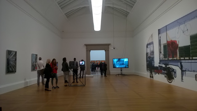

Space of the exhibition "The Weight of Data".
Author's own.

Caption of the video "Colocation, Time Displacement".
http://dismagazine.com/dystopia/61140/colocation-time-displacement/